When your Data Narrative is unclear: Our Humboldt Beginnings

Shawn Dean
2024-10-23 · 10 Minutes

Data visualization and analytics are critical for understanding student success in federal education programs
In the world of federal education programs like TRIO and GEAR UP, data isn't just numbers—it's the story we tell about student success. But what happens when that story becomes muddled, contradictory, or incomplete? When your data narrative is unclear, critical insights get lost, resources become misallocated, and the very students we aim to serve fall through the cracks.
The Cost of Ambiguity
During my time as a GEAR UP advisor at Cal Poly Humboldt, I witnessed firsthand how unclear data narratives can mask significant disparities in student outcomes. While aggregate numbers might show overall program "success," drilling down revealed troubling patterns:
- Del Norte saw a 10% increase in financial aid completion
- Eureka High School showed a 4% increase
- Hoopa Valley High experienced a 24% decrease
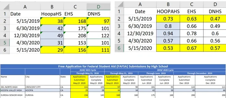
Financial aid completion disparities across GEAR UP service sites revealed significant gaps in program delivery
The aggregate narrative suggested the program was working. The disaggregated reality told a different story—one that demanded intervention.
Common Sources of Data Ambiguity
Inconsistent Tracking Methods
When different advisors use different tracking systems, or when documentation practices vary across sites, you end up with data that can't be meaningfully compared. One advisor might log every phone call; another might only document in-person meetings. The resulting dataset tells multiple stories—none of them complete.
Missing Context Variables
Raw completion rates don't account for:
- Student mobility and transfers
- Family circumstances and economic barriers
- School-level support infrastructure
- Community-specific challenges
- Advisor caseload and turnover
Without this context, we risk attributing outcomes to program effectiveness when they might actually reflect environmental factors beyond our control.
Overly Aggregated Metrics
When we roll up data to the program or district level, we lose the granularity needed to identify:
- Which interventions work for which student populations
- Where to allocate limited resources
- Which schools or communities need additional support
- What specific barriers are preventing student success
Building Clarity: A Framework
1. Define Clear Outcomes Upfront
Before collecting any data, establish:
- What specific student outcomes are we trying to influence?
- What evidence would demonstrate we've succeeded?
- What timeframes are realistic for seeing change?
- What external factors might confound our results?
2. Standardize Data Collection
Create uniform protocols that all staff follow:
- Standardized contact logging procedures
- Consistent categorization of student interactions
- Shared definitions of key terms (e.g., what counts as "college-ready"?)
- Regular training to ensure protocol adherence
3. Disaggregate Strategically
Break data down by meaningful dimensions:
- School site and community context
- Student demographics and risk factors
- Type and intensity of intervention
- Advisor assignment and support model
4. Connect Data to Action
A clear data narrative isn't just descriptive—it's prescriptive. For every finding, ask:
- What action does this suggest?
- Who needs to take that action?
- What resources are required?
- How will we know if the action worked?
From Ambiguity to Insight

Standardized data collection frameworks help transform ambiguous metrics into clear, actionable insights
At Innovate for California, we've built tools specifically designed to cut through data ambiguity. Our Learning Blocks platform helps education programs:
- Standardize data collection across sites
- Visualize disparities that aggregate metrics hide
- Connect student-level data to intervention strategies
- Generate clear, actionable narratives for stakeholders
The goal isn't just better dashboards—it's better decisions. When your data narrative is clear, you can:
- Identify struggling students earlier
- Allocate support where it's most needed
- Demonstrate impact to funders and communities
- Continuously improve based on evidence
Moving Forward
If your current data feels unclear or contradictory, that's not a failure—it's an opportunity. Start by asking:
- What question am I trying to answer? Get specific about the decisions this data should inform.
- What's getting in the way of answering it? Identify gaps, inconsistencies, or missing context.
- What's the smallest change that would add clarity? Don't try to fix everything at once.
Data narratives don't have to be perfect to be useful. They just need to be clear enough to guide action. And when they are, the impact on students can be transformative.
About the Author
Shawn Dean is the founder of Innovate for California and former GEAR UP advisor at Cal Poly Humboldt. He holds a Master's in Data Analytics with a specialization in Teacher Leadership and currently serves as Director of Data Analytics at Gateway Community Charters.
Want to learn more about transforming educational data into actionable insights? Contact us to explore how Learning Blocks can help your program.